Typeseting, like translation, is a very personal choice. Each typesetter does it differently, and there is really no "right" way to do it. Just like translation, some prefer to be as close to the original typesetting as possible, where some take a more liberal approach. Most of the time, the uniformity of a group's style is going to have more of an impact on an editor's decisions. However, there are still some general guidelines that can improve the overall typesetting aesthetics, and some other de facto standards that most manga/comic use, and can improve uniformity; some of them are listed here.
-
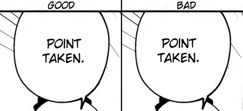
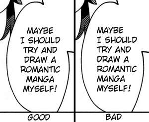
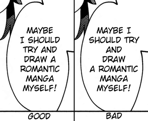
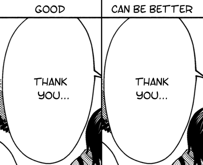
Center the text in the bubble.
-
Center-justify
-
Try to make the text follow the bubble contour.
Sometimes long words in awkward places also needs to be hyphenated for this, which brings us to the next point.
-
Hyphenate correctly. It's best to consult a dictionary to be sure to hyphenate words at the right places.
For example, dif·fi·cult can be hyphenated as "dif-ficult" or "diffi-cult", but not "diff-icult".
-
Don't overcrowd the bubble, but also don't make font sizes too small so as it's difficult to read on smaller screens.
Sometimes a typesetter will need to work back-and-forth with the translator to ensure that text can be typeset properly by moving content around different bubbles, or by adjusting the wordings to make things shorter or to make long words easier to place.
-
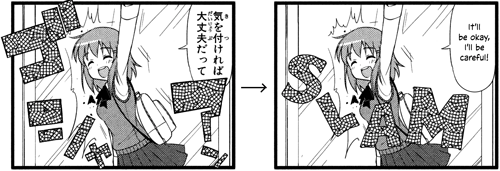
Put white/black borders around text that need to intersect artwork. Generally, this is already done by the original mangaka already if the Japanese text needed to intersect artwork (unless it's sound effect/SFX, where anything goes). E.g.
In Photoshop, this is done with Layer → Layer Style → Stroke
-
Try to preserve the original style whenever possible. This often means try to follow the author's typeface choice (angular or round, formal or playful, organic or digital, etc.), as well as letter outlines, stroke or not, fill color/patterns, character placement, etc.
-
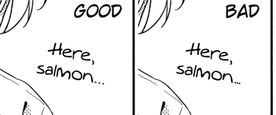
Insert one or two spaces before lines with ellipses to "balance" out the text centering
-
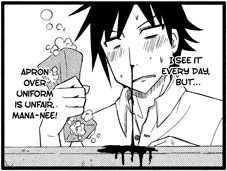
Sometimes, a font's default kerning is not very good, and some manual per-letter tracking changes would be required. A common occurence is with augie font, which Bakkin uses for out-of-bubble hand-written dialogues, where the periods are packed way too close to each other and need to be manually spaced out.
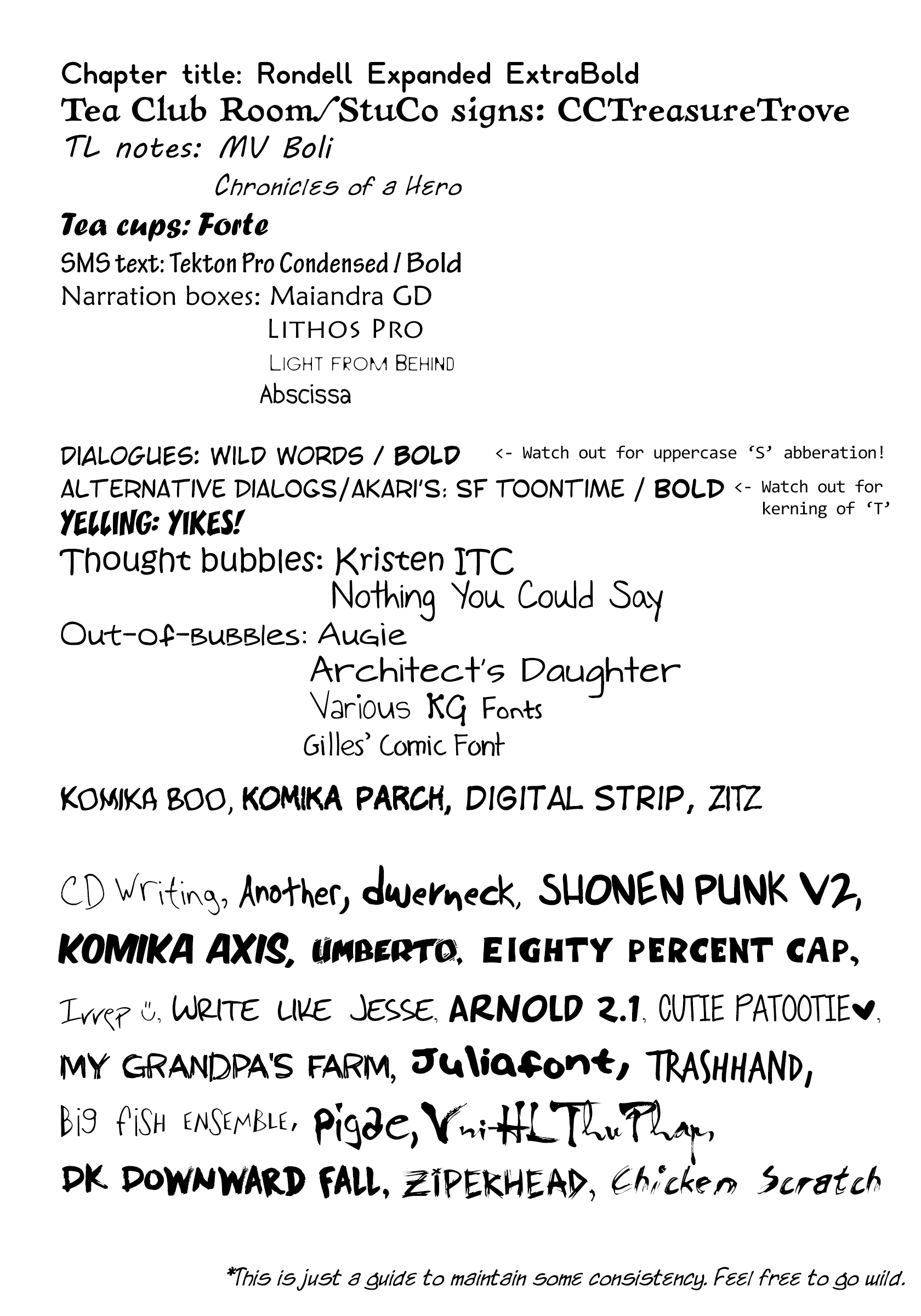
- Most importantlly, stay within the existing style guide of the group, especially font choices for main fonts